Design

FBHT

I’m surprised I never got around to putting this on the blog, because I made it ages ago. I have a really expensive habit of just making shirts for me to wear around, generally for bands I like that don’t sell much in the way of merch. It’s about a zillion times more expensive per shirt to just print one, but the heart wants what the heart wants. And the heart wants a shirt with some nooses on it.

This doodle started with one that I made for my word art project, for Mother Mary, but I figured a shirt would make more sense with the band name on it.

fbht

Because it’s an FAQ, no I can’t sell you one, because licensing. Take it up with their manager.

Standard
Design

February

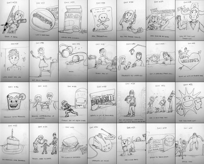
I’m pretty behind on the wrap-up posts for the Doodle-a-day project. I was planning on posting one of these after every month that I finished, which I’m still doing just… like later. I’m a bad blogger. Anyway, if you want to keep up with the project in real-time, I am still posting every day to my instagram. For the rest of you, here’s some stuff I did a few months ago.

february_doodleaday

Standard
Design

Process

It’s been a little quiet around here. That’s usually the case when summer hits, and it turns into wedding and festival season. I’ve still been hard at work, I’m just too busy to blog about how busy I am (which, can we all stop doing that, forever?)

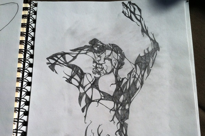
One of the projects I’ve been doing is a t-shirt design that I’m pretty excited about. I do a lot of my work on the computer, so using an actual pencil, with my hands, is so much fun. It’s definitely not finished, but I always like to see other people’s process, especially when it comes to hand-drawn things.

Adam had a fairly solid idea of what they were looking for when he contacted me, concept-wise, but not so much on the execution. So I spent my down-time at the LAN… I mean, umm… at… something not nerdy… working on sketches. The guy started out with a face, but I ended up liking the suggestion of a figure more than straight drawing one.


The band name will be worked out in much the same style, and the idea is for it to be one cohesive graphic when it’s finished. Looking forward to seeing this one on press.


Standard
Design

Green Day Mix Tape Shirt

I’ve been pretty lucky, in getting to work on some extremely cool projects. But I think this one wins the prize.

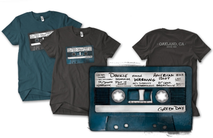
Green Day Mix Tape shirt designed by Caroline Moore


I’ve been a huge fan of the band since I was 11 years old, so being able to design something for them is one of those bucket list things that I never thought I’d actually get to do. But you can now purchase a shirt that I designed, from Green Day’s website. 11-year-old me would be both crazy excited and generally confused by the concept of the internet.

I had a number of people ask, so here’s how I ended up with the design. I started out by complaining to my husband that Green Day has something like 20 years worth of graphics, and have a ton of imagery to pull from. He said something to the effect of, “Well, just remember what you like about them. Draw that.” So I thought about how I got into the band in the first place.

My dad used to have a habit of wandering around NRM and just buying something. Either he liked the album artwork, or thought a band name was cool, but he’d pick something up at random and give it a whirl (one year, he bought me a White Stripes album and Gregorian Chant Music, you just never know what the man’s gonna get into). Some afternoon while we were out shopping, he bought a copy of Dookie. Later, we were tooling around in his Pontiac Sunbird and waiting for the tape to flip (has a more 90’s-nostalgia-ridden sentence ever been written?), when “All By Myself” came on and this conversation happened:

Dad: “Man, those kids are baked.”
Me: “Heh, yeah they are.”

Dad: “Don’t tell your mom you know what baked means.”

Since my first encounter with them came from a blue cassette tape, I figured I’d run with it. Making the actual artwork took a bit longer. I doodled up a cassette in Illustrator (so that I could scale it), and made a shadow, midtone, and highlight layer. I found some grunge brushes that I liked, and made a few out of textures I’d put together, and then just layered the crap out of them in Photoshop, and fiddled with the transparencies and blending modes. Honestly, the PSD file was an absolute ton of layers (all named super helpful things like “Layer 6 copy” – why do I do this to myself?) I probably couldn’t reproduce that exact graphic again if I wanted to.

The text is actually all handwritten. I had about 5 pages of various album titles written over and over again (sort of a Waiting print redux). “Green Day” and “Dookie” I actually nailed on the first try, but for the rest, I tested out a few versions. I had to figure a way to censor “Awesome as Fuck,” for sales purposes, and figured I’d just make it look as though it had smudged off. Which I did by… actually smudging it before I scanned it in. The whole thing is sort of a weird mix of computer generated and hand-made.

If you’re into it, they actually printed up both colorways. So you can get gray on blue, or blue on gray, right here. Thanks to Green Day, and the folks at Artist Arena, and John Moore, and my dad, who it turns out it way hipper than me.


Standard
Design, Firefly Posters

Pittsburgh Browncoats

I’ve been attending Can’t Stop the Serenity events for a few years now, and this past year contributed as a vendor. Since about every other person there asked me to make a Pittsburgh Browncoats shirt, I decided to finally get it done. Now you can show some hometown pride and your love for sci-fi westerns.

Pittsburgh Browncoats Shirt

As for the details on this bad boy, it’ll be printed up at a local shop, on snazzy ringspun cotton shirts. Men’s sizing, small through XXXL. And if that’s not cool enough, you’ll also get free shipping to anywhere in the USA (yes, Hawaii, you too). I’m putting in the order for the first run next week, so get your orders in to the Op Ink shop.


Standard
Design

Weapons of Mass Creation

Yeah, it’s that time of year again where I start telling people how they really need to go to WMC Fest (June 8-10, 2012). Last year was the first one I was able to make it to, and I know that Jeff and company have been working crazy hard to make this year’s even better.

Explaining what exactly the festival is… well it’s a lot of things. It’s a design conference – they have 20 amazing speakers lined up from all different disciplines, and I learned a ton last year.

And it’s a gallery show – you can check out and purchase some great artwork (I’ve finally gotten that Aaron Draplin print framed, this year I plan on blowing some serious cash on Jon Contino’s work).

Oh, and a music festival. I think they’re up to around 30 bands for this year, and have locked down a new space. You get to see Signals Midwest and Two Hand Fools before they play The Fest in the fall (congrats to both of yous, by the way).

It’s also a pretty amazing community event. I spoke to a lot of attendees last year that said they felt like they’d gone to summer camp. You meet a ton of cool people, and most of the cool people that I met at last year’s are coming back – as speakers, or artists, or just to hang for the weekend.

Now usually when I look at design conferences I get psyched about the speakers, the content, and then I look at the price and go back to what I was doing. I don’t have a day job subsidizing my continuing education, which means I can’t drop a grand on a conference (not including travel, etc.) The other awesome thing about WMC Fest is that it’s $50. That’s not even per day, or per conference hall, that’s it guys. For $50, you get access to all of the speakers, the gallery, and the music for the whole weekend. As an added bonus for my East Coast crew, it’s in Cleveland, which means the travel for us is also mega cheap.

That said, I believe it’s $50 through April 30th. I’m sure the price will still be totally reasonable after that, but this is the cheapest it’ll be. If you want to get your tickets and some swag to go with it, check out the WMC Fest Kickstarter. For the same $50 you were going to spend on tickets, you can get tickets and some cool WMC Fest gear, plus help to make sure they get funded (for those that haven’t been involved in Kickstarter projects, you only get money if the goal gets met. So if they don’t meet their $7,000 goal in time, they get $0).

And if $50 is still too much for you to spend on this sort of thing (hey, we’ve all been there), consider volunteering. I volunteered last year to take photographs during the presentations, and they have spots available for all different skill sets. This year, I’m actually going to be organizing our photo squad (so if you have some photography skills, or have a friend that does and might be interested, get in touch with me). You can also sign up to volunteer for any position here, or sign up for the street team to help spread the word.

Seriously, folks, go get those tickets.


Standard
Design, Personal

Pixel Quilt

So my mother quilts and is pretty nerdy. There aren’t a ton of gift options in that particular Venn diagram overlap, so I went ahead and made her this custom iPad cover.

She’s pretty partial to the log cabin blocks, and apparently this pattern in particular. Setting up rectangles in Illustrator for the pattern didn’t take all that long (thanks, snap to grid!), but making all of the “fabrics” was a little time-consuming. It’s 13 different patterns, that I set up and then saved as swatches in Illustrator. I’ve always been a lot better at fabric picking than I was at the actual construction part of quilting, anyway.


Standard